(Case Study)
ALL DAY COMFORT,
ALL DAY SAFETY.
ALL DAY SAFETY.
Developing a set of brand guidelines
Brand guides can be as simple or as complex as needed. They act as a set of established rules and what the guidelines cover can change depending on the needs of the organization.
In the case of Supera™, a logo, mission/vision, and font had already been selected. However, there were still a few things left for me to flesh out!
Colour Palette
The primary palette of blue, white, and black, was chosen based on the goal of being a fashion forward brand.
Primary Palette
The blue was given to us as part of the original logo design. My suggestion was to have one branded colour in the primary palette and use the stark contrast of black and white as the two accents in the majority of the designs.
I felt this would contribute to recognizable eye-catching designs that would be "fashion forward" without giving the impression that Supera™ was all sizzle and no steak.
Secondary Palette
Supera™ is owned by Superior Glove Works. LTD and so we wanted to bring in a few colours influenced by the already established brand. We added the grey as a softer alternative to the black and decided on using the SGW Orange to help the blue pop!
Logo Usage
The second but equally important item is how the logo should and should not be used (specifically, outlining size and location on a page, ad, social post, etc.). The "logo misuse" has typically been reserved for the "non-designers" and those unaware.
I like to establish these two items (the colour palette and logo) early on as they affect a lot of the design going forward.
Fonts
A good set of fonts are fonts that work together and support your brand. In Supera™'s case we opted for Helvetica Neue LT. Specifically, using the condensed and light versions together to create a familiar but separate look from the Superior Glove Brand.

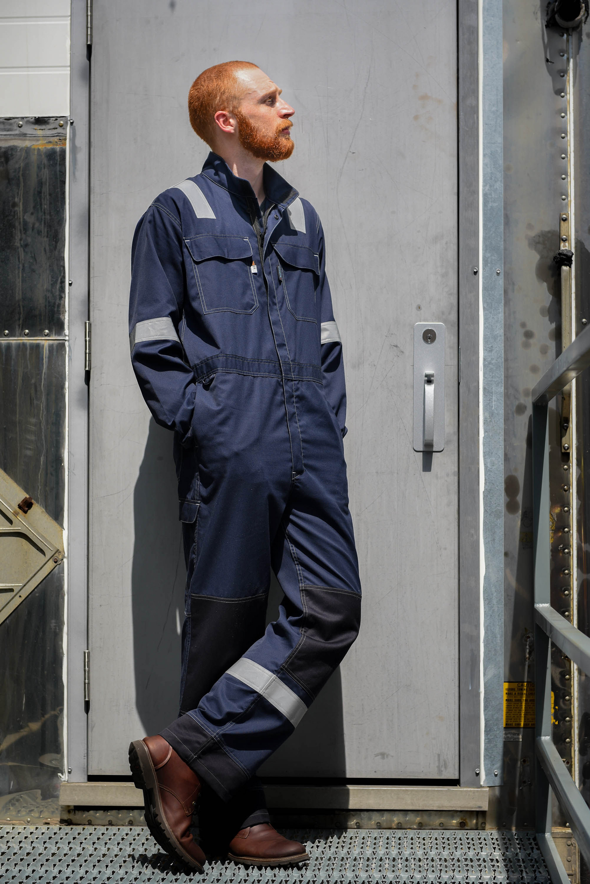
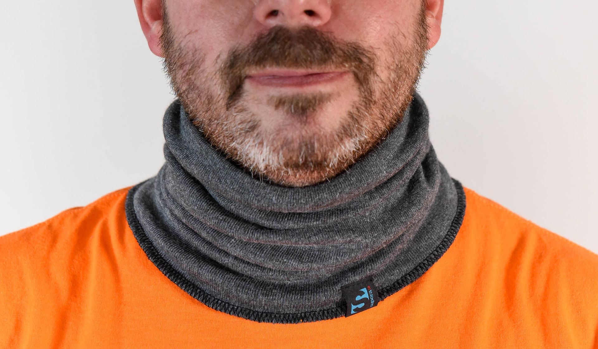

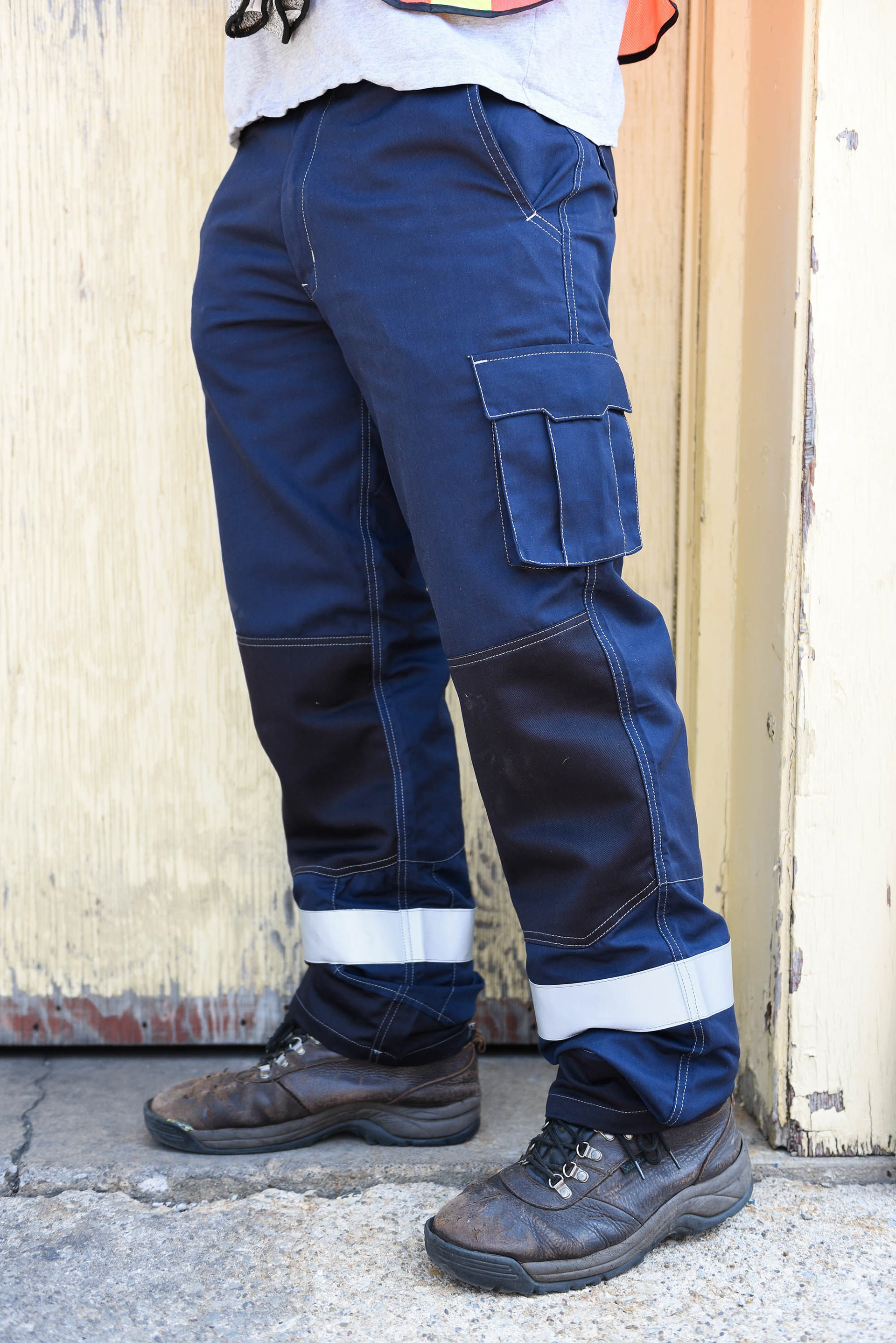



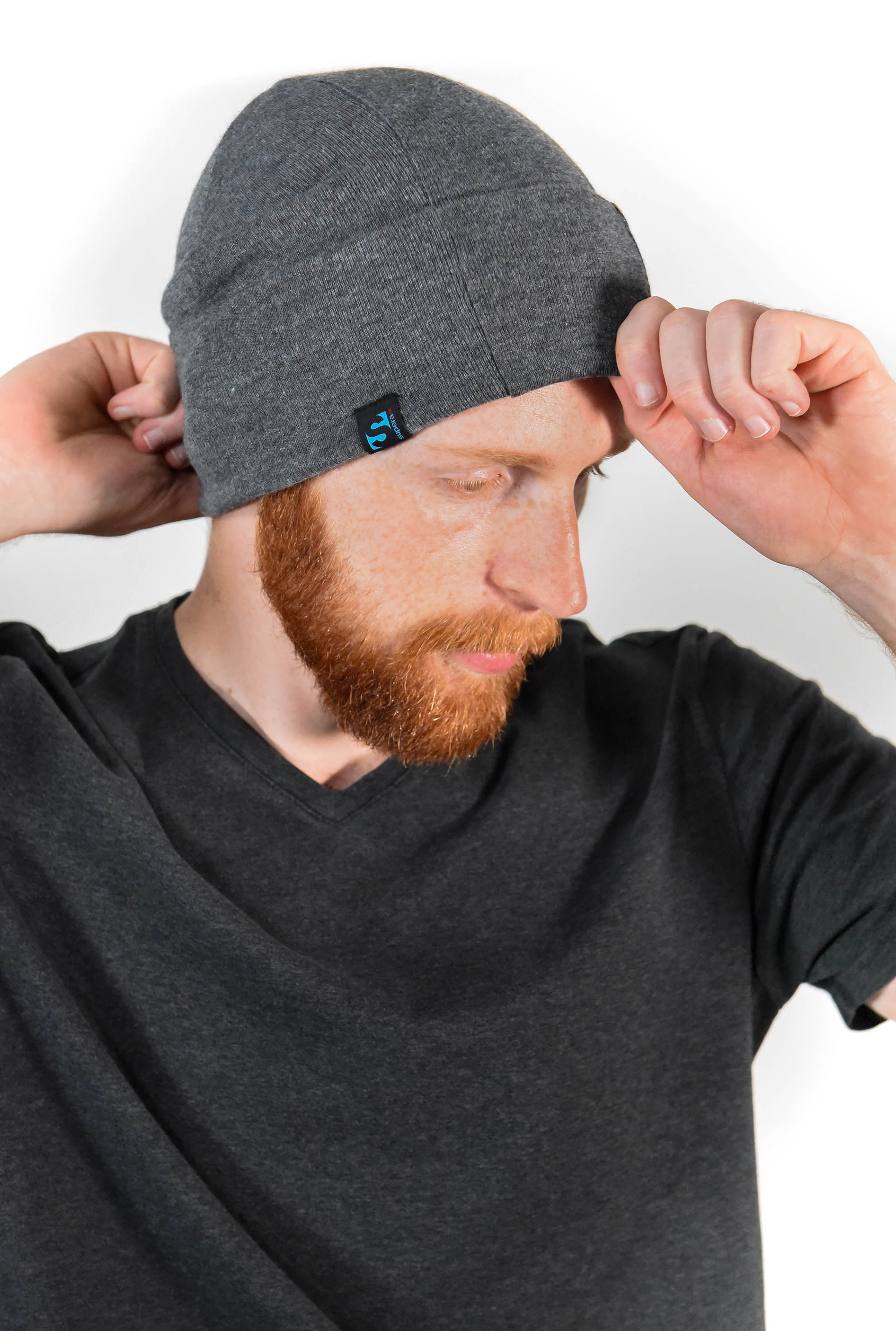
Photography
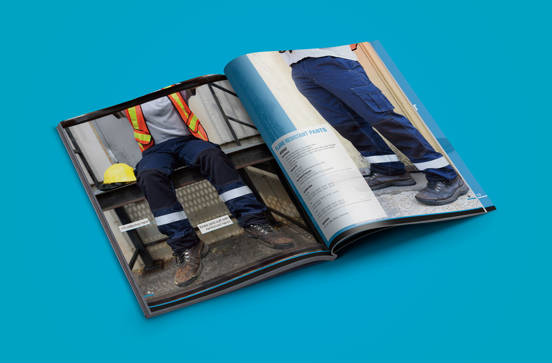
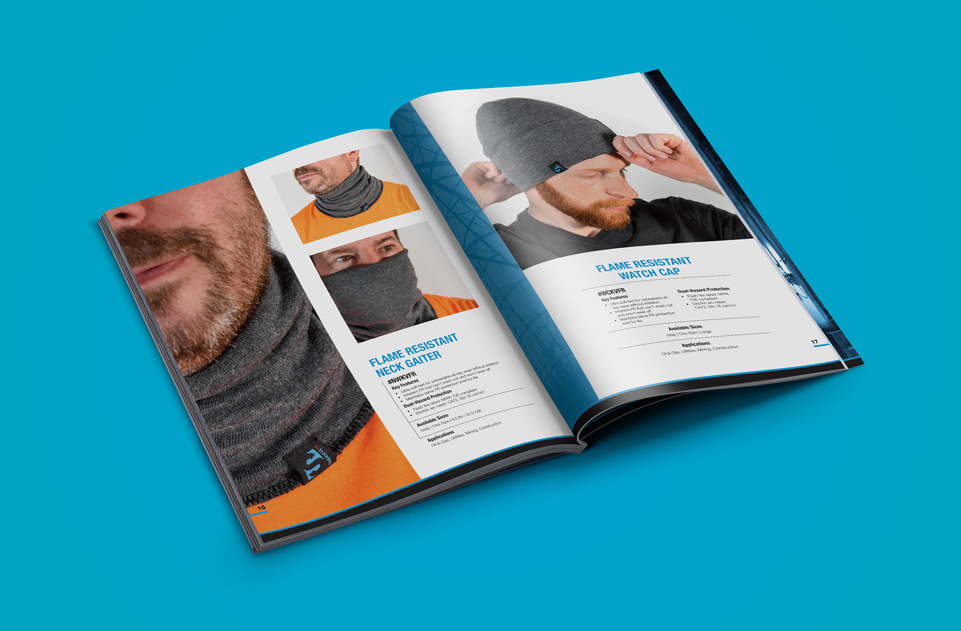
Whether it's commissioned photography or stock imagery, it was important that we maintained a consistent look and feel.
Both these photos and those selected in the inspiration section are used for direction when planning new images.
Supera™ Photography by Jess Campaigne:
Inspiration
When fleshing out a set of brand guidelines, I like to devote a small section on the inspiration behind the designs. It helps create a solid foundation and starting point for new initiatives.
For Supera™'s imagery, atmospheric and candid fitness images are the reference point. They align well with balancing performance and comfort - and in Supera™'s case, safety and comfort.




Additional Sections to consider
As I mentioned at the top of this page, your brand and visual identity gets to be as complex or as simple as you need it to be.
Other areas to consider developing are; clothing, social media posts, tone/style of writing, letterhead, or anything you feel needs guidance.

If you want to develop a brand identity or are thinking about a brand refresh,
I'm here to help!
I'm here to help!